Be Well Therapy PLLC

The Overview
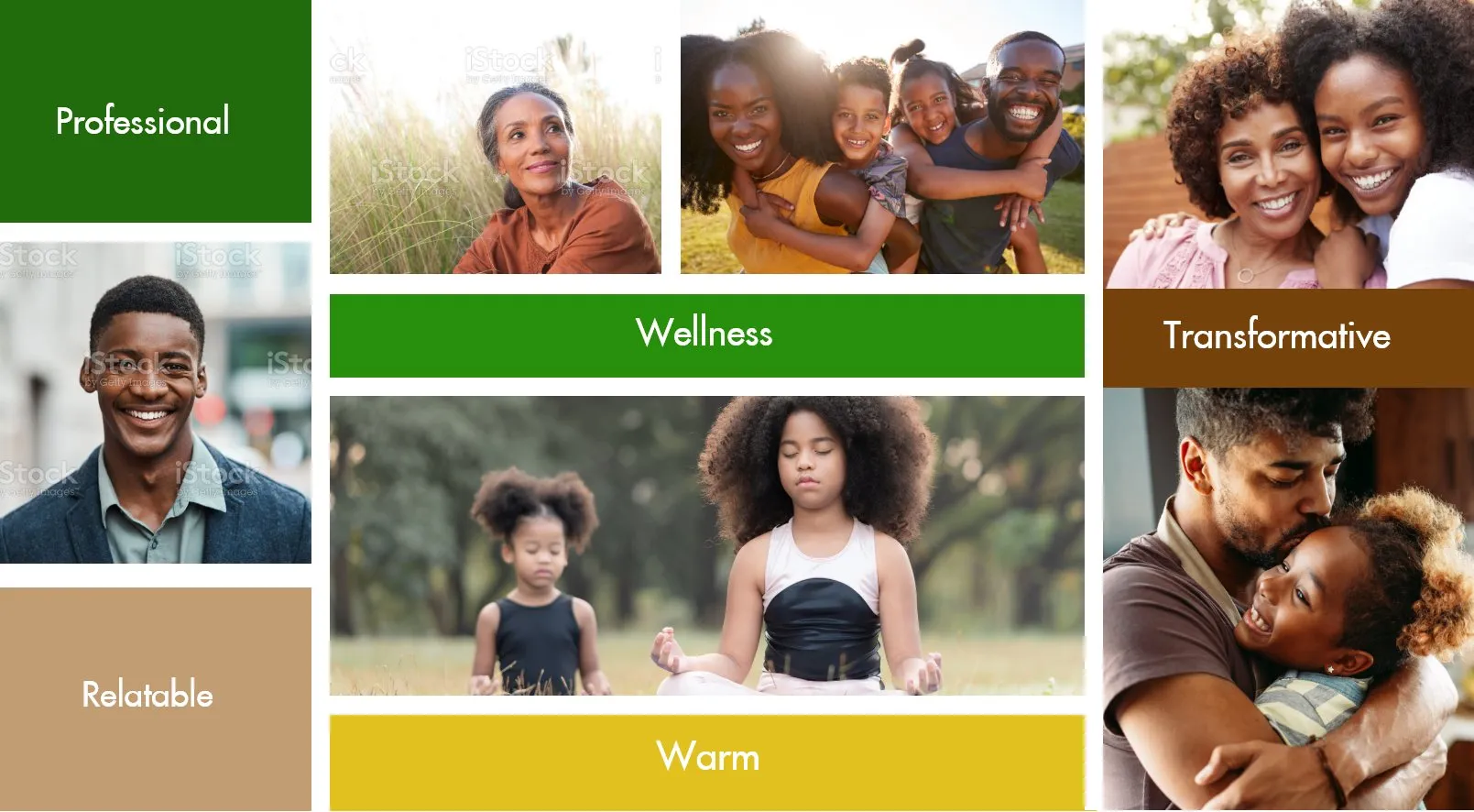
Be Well Therapy PLLC is a licensed counselling practice serving individuals, couples, and families across diverse communities. With a growing team and an expanding client base, they needed a brand identity that reflected their holistic, family-centred approach — professional enough to build trust, warm enough to feel welcoming.
The Challenge
Be Well Therapy's existing visual identity no longer reflected the depth and warmth of their practice. As they grew, they needed a cohesive brand system that could speak to families seeking therapy — communicating professionalism and expertise while feeling approachable and safe. The brand needed to work across all touchpoints and scale with the practice.
The Result
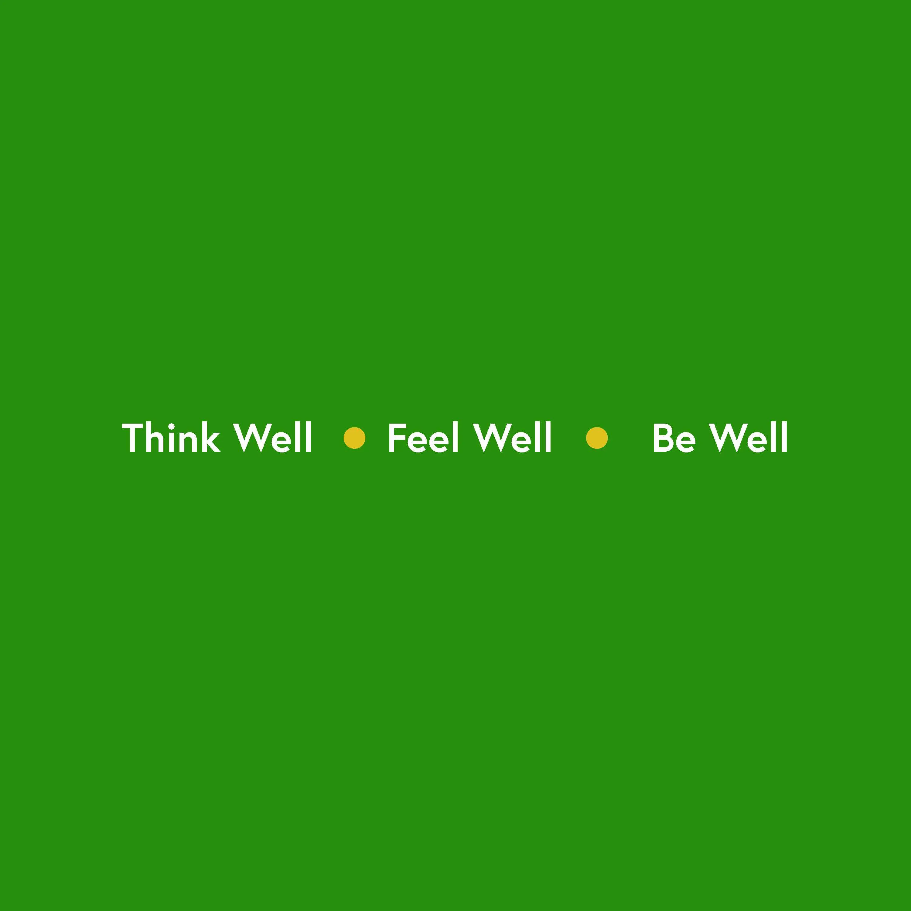
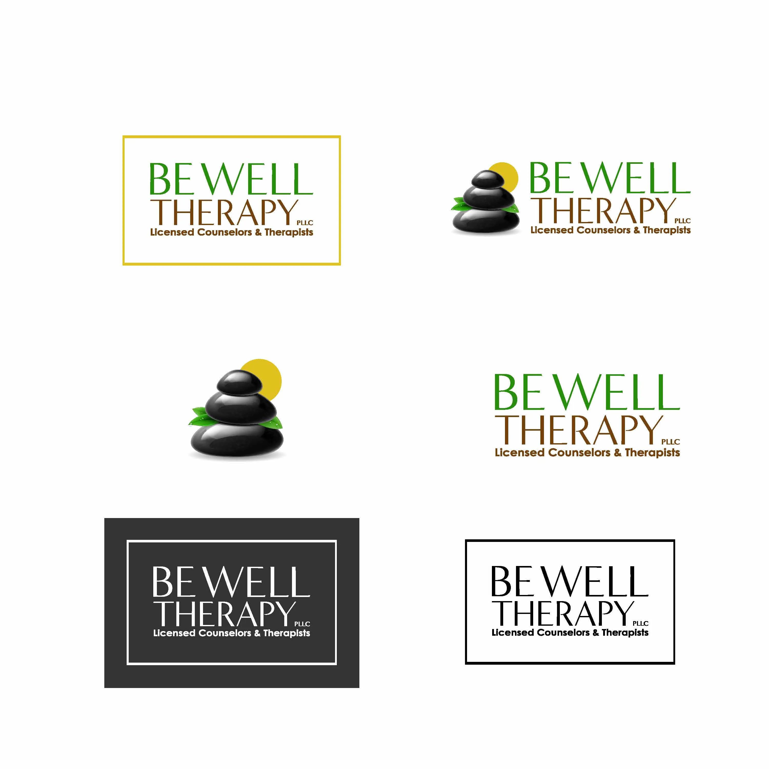
A complete brand identity rooted in wellness and transformation. The earthy green, yellow, and brown palette communicates growth, warmth, and natural healing — values at the heart of Be Well Therapy's approach. The refreshed identity gave the practice a scalable visual foundation and a clearer, more confident presence to grow from.
Branding - Mood Board
Branding - Color Palette

Branding - Logo
Services Delivered
A complete brand system built to reflect Be Well Therapy's values of wellness, warmth, and transformation — designed to scale as the practice grows.